
Rebrand or re-route?
Old faithful
Sea, land and sky concepts
I love my old logo. It’s been me for years, and still, I love the way it looks. But when I ask myself what story it tells or what it stands for, I really have no clue. And honestly, I’m not sure I’m ready to break up with it. We’ve been together a long time, and it feels like part of me!
After a long break from creating, I’m slowly finding my way back into my creative space. But something has shifted. I’m returning with a clearer sense of the values that matter to me and a growing desire to create work that means something beyond its aesthetic appeal.
I wanted a fresh start. A new look that would help me redefine who I am as a designer and give my work a stronger sense of purpose.
So, I spent time revisiting my values and asking myself what really matters. One theme kept returning: our relationship with the natural world and the impact we have on it.
The place I now call home, the beautiful islands of Moreton Bay, is a constant reminder of how much we stand to lose. Trees are disappearing, birdsong is becoming quieter, and some species are no longer seen in places they once called home. Our oceans face mounting pressures from pollution, overfishing and warming waters. It’s difficult to witness these changes and not feel compelled to do something, however small.
For me, that something is art.
I want my illustrations and surface pattern designs to do more than look beautiful. I want them to tell stories, spark curiosity, encourage connection and perhaps inspire people to look at the natural world a little differently. If my work can help someone notice, appreciate or care more deeply about the living things around them, then it has a purpose beyond the page.
As I explored how to bring these values into my new branding, I kept coming back to the elements that make up our living world.
The Sea. The Land. The Sky.
Three interconnected worlds, each filled with extraordinary creatures, delicate ecosystems and stories worth telling. The sea holds its marine life, the land nurtures its botanicals, fungi and wildlife, and the sky belongs to the birds and insects that connect us to the wider world.
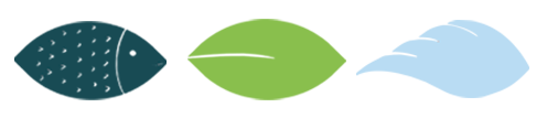
Gradually, these three worlds became the foundation of my creative direction — and the inspiration behind three simple symbols: a fish for the sea, a leaf for the land, and wings for the sky became the combined elements to form my new logo.
Together, they represent more than categories of my work. They reflect the values I want to carry into everything I create: a deeper appreciation of nature, a desire to raise awareness, and a belief that creativity can help us see the world with fresh eyes.
As I begin making art again, I want these values to sit at the heart of my practice.
So, perhaps this isn't simply about getting a new logo after all. Perhaps it's about discovering what I want my work to stand for, and finding a visual language that finally tells that story. And I’m still questioning if I need a new logo or just a new direction with a distinctive purpose.
Sea. Land. Sky. Three worlds, one interconnected story.